Diamine Inkvent 2023: A New Year’s Eve review
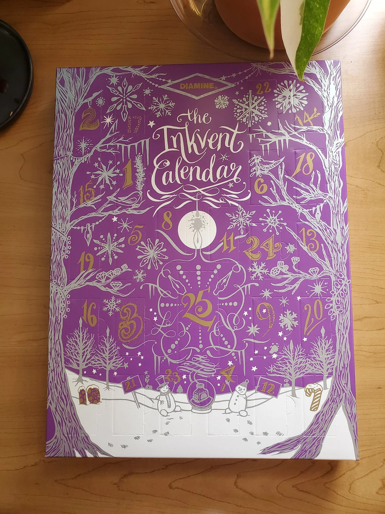
On the 26th of December, Bogi snagged the Purple Inkvent for me, on sale for 50% off. It arrived just before New Year’s, and as a result, I was able to sample the inks. There are many thorough and thoughtful Inkvent reviews out there already, and I’m quite a few days late with this inksploration, but better late than never. I am posting it here as a New Year’s Eve bonus. :)
It’s purple! I resisted this inkvent originally, even though I love purple - but after reading everyone’s reviews, I was looking forward to it.
Over the years, Diamine grew on me as a brand. Initially I was overwhelmed by the amount of options, but now I think Diamine has a lot to offer, both literally and figuratively. I found out that I love Diamine Inkvent shimmers for art (the artist book for Bogi is the second art project I do with them). I enjoy the 12ml bottles as a sample size which is manageable and easy to use for both writing and art.
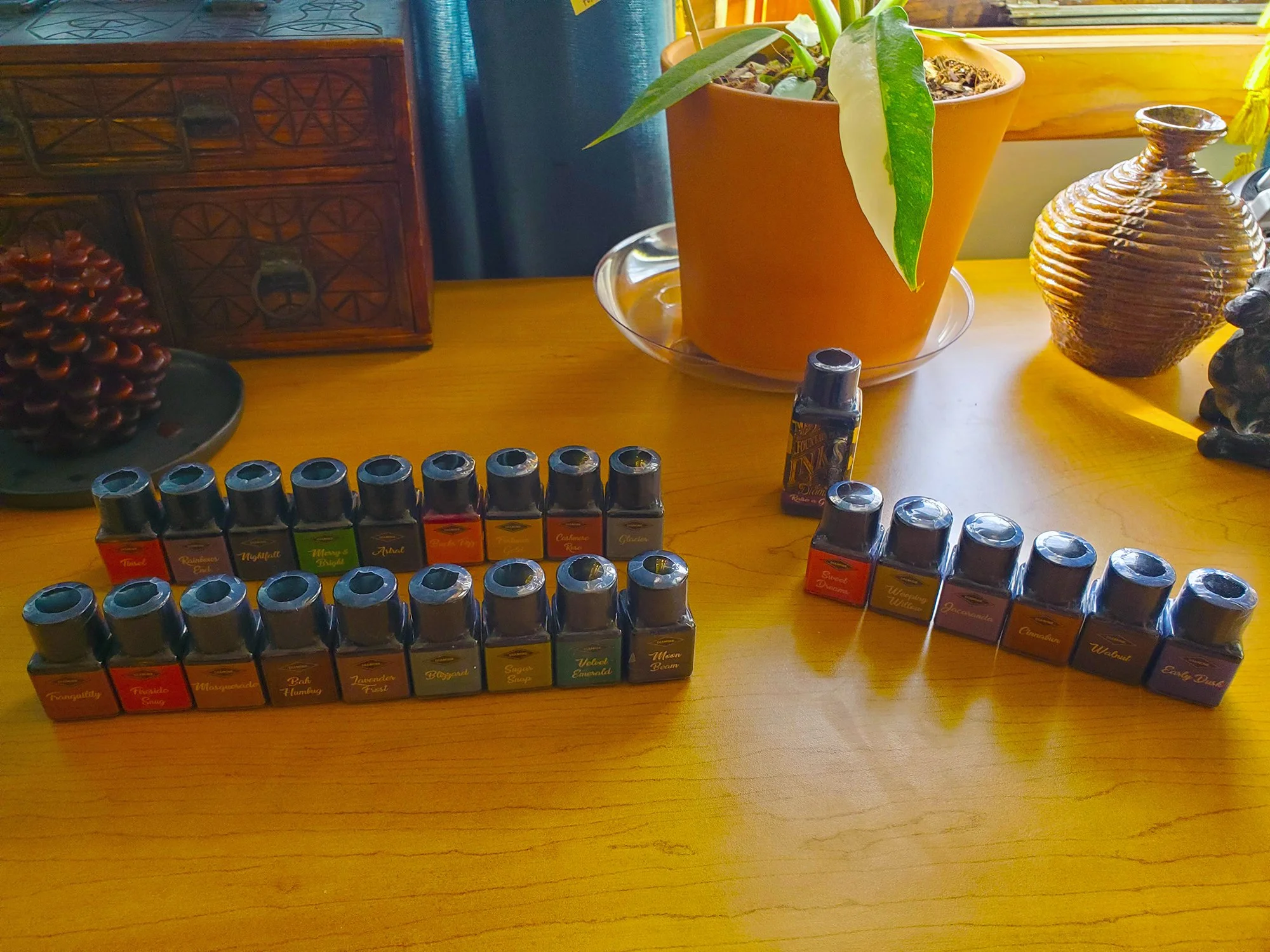
Tentative Yes pile on the front left, Maybe on the back left, no on the right, and a lone 30ml bottle of “I hate this bottle shape.”
Since I followed Inkvent reviews from other bloggers, I had some preconceived notions of what I might or might not like.
In the YES pile I had Tranquility, Fireside Snug, Masquerade, Bah Humbug, Lavender Frost, Blizzard, Sugar Snap, Velvet Emerald, and Moonbeam.
In the MAYBE pile I had Astral, Rainbow’s End, Nightfall, Merry and Bright, Buck’s Fizz, Fortune’s Gold, Cashmere Rose, and Glacier.
In the NO category I had Sweet Dream, Weeping Willow, Jacaranda, Cinnabun, Walnut, and Early Dusk.
Raise a Glass was in its own category of “I don’t like 30ml Diamine bottles.”
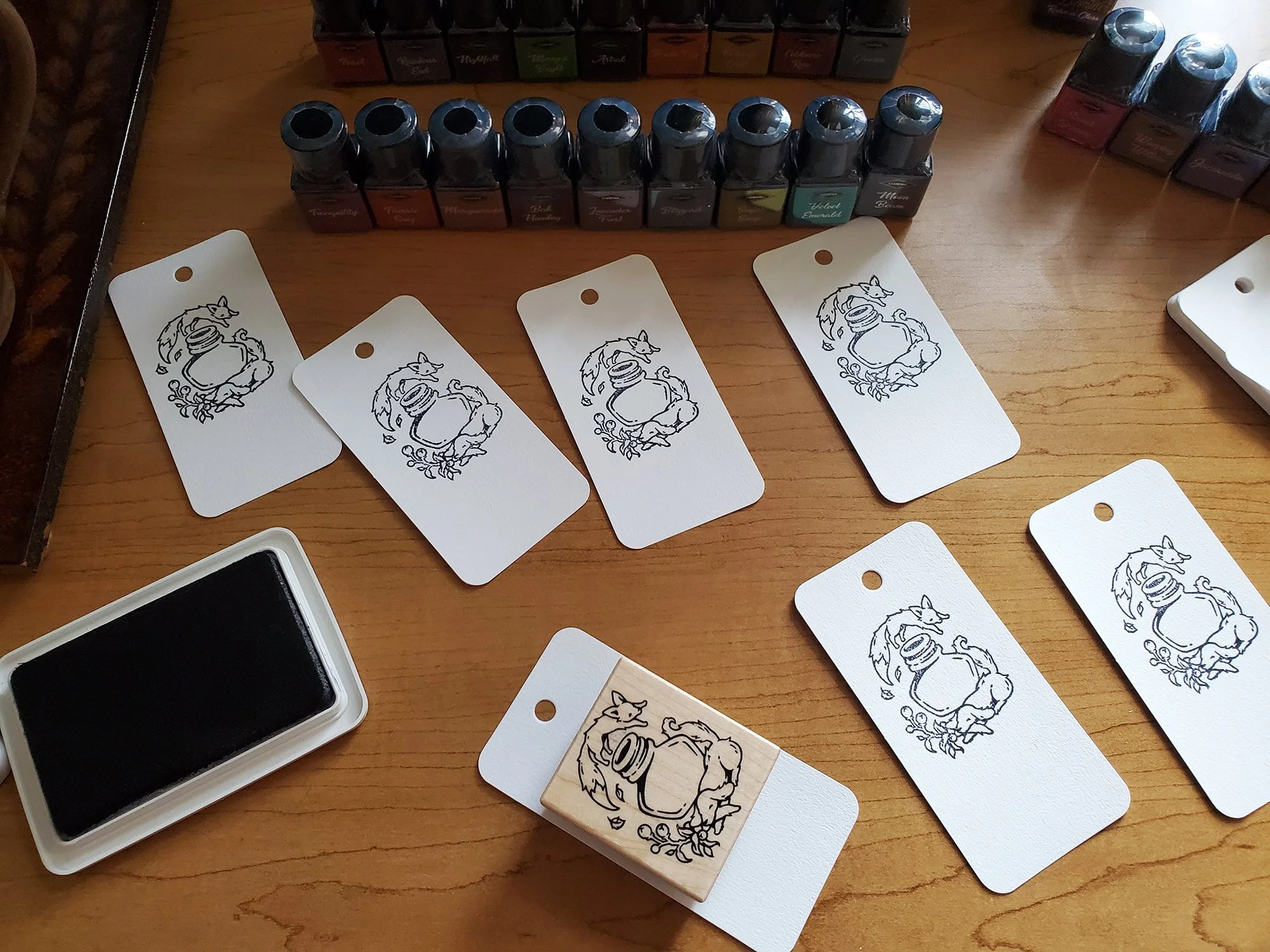
I swatched the inks using Col-O-Ring, Fox and Dog stamp from Yoseka, Q-Tips, and the Sailor Hocoro dip pen. The Hocoro is really not for me, but that’s what I had on hand.
Initial impressions
Here are my initial bottle-by-bottle impressions, in alphabetical order. These reflect my preferences, rather than the quality of the ink - your mileage may vary!
Astral. It’s black with "chameleon" shimmer. It's ok, but I have 2 bottles of black with shimmer, and I’m not a fan of black ink. Verdict: NO.
Bah Humbug. The name is doing a lot of work for me here: I know others loved this ink, but I was disappointed. It migrated from a yes pile to a maybe, and is hanging on for dear life in that category. It's really dark. From my perspective, the shimmer does not add much. I would rather ink Teranishi Classy Burgundy (which is similar, but does not have shimmer). Verdict: MAYBE.
Blizzard. This ink put a big smile on my face. I feel it’s like Montblanc Glacier, but with shimmer. I need to comp these inks, but I love this one (*comps are below). Verdict: YES
Buck's Fizz. I was sure this would be an art ink. Too pale for writing, but I thought, well a pale orange with shimmer should be nice for art, right? Well, I thought it was terrible. Flat, pale, and did not hold my interest. Verdict: NO.
Cashmere Rose. A lovely color, great shader. I just don't write with pink(ish) inks. Verdict: MAYBE.
Early Dusk. It is a standard ink, maybe not the most exciting offering here, but it's actually nice. If you like more gentle blues with a hint of blurple, this should appeal. I just don’t know if I will ever ink it, there are many inks I like more. Verdict: MAYBE.
Fireside Snug: this migrated from a yes to a maybe. It's a wonderful burned orange, but I need to comp it to others in my ink library to see if I actually need it. My feeling is it will be close to Taccia Koiame. (* see comparisons below). Verdict: MAYBE.
Fortune's Gold: a gold with a hint of green shimmer. This is a great color for art. I would not use it for writing. I use gold shimmer in art quite a bit, and this is lovely - and I like it better than Gold Star from 2019 Inkvent. Verdict: YES FOR ART.
Glacier ("star bright"). Not a dupe of Montblanc Glacier. This ink consists of 100% shimmer content. It's a nine inch snowfall of shimmer. This will be great for art, but I would not put it in a pen. Verdict: YES FOR ART.
Jacaranda. A standard ink in a sea of shimmer. It’s a pale blurple, which does not fit in my use case at all. Verdict: NOPE
Lavender Frost. Awesome, this is an actual purple gray, and the purple element is pronounced. So refined. Love it. Verdict: YES
Masquerade: a wonderful surprise. It's pinkish, and it’s not a color I would use in writing since I don't really use pink, but in large applications it's really interesting. A bird would look amazing in this color. Verdict: YES FOR ART.
Merry and Bright. SO BRIGHT. It is like someone wrapped a crocodile in foil. I was missing this color for art. So YES FOR ART.
Moon Beam. I was looking forward to this one, but it’s a disappointment for me. It is supposed to be a greenish gray, but the "greenish" connection is slight. It reads gray to me. I know it will have many fans, but I'm not much for gray ink. Verdict: MAYBE, but not really.
Nightfall. A very pleasant surprise. I don't have a good blue-black with shimmer, and this is lovely and might be used for writing in Fall-Winter. Verdict: YES (migrated from maybe).
Raise a Glass. I do not want to raise a 30ml glass of this ink. I don’t like these 30ml plastic bottles. I do like the ink! Raise a Glass is a very dark purple, think Montblanc Enzo or Scribo Notturno Viola, but with shimmer. I would rather ink a nonshimmer in this color - I use dark purples endlessly. This would be a yes if it came in a 12ml size. Verdict: MAYBE.
Rainbow's End. Migrated from a maybe to a yes. More blurple than purple I think, but really pretty with shimmer. Verdict: YES.
Sugar Snap. Not a holiday situation, which is great because this is inkable all year long. Also great for art. Verdict: YES.
Tinsel. This was a maybe, but it's pinker than I thought. I am not excited. Verdict: MAYBE leaning NO.
Tranquility. A wonderful surprise. Easily my top 5 inks from this set. Bright, but not too blaring, interesting color, really nice. I need to comp it to Montblanc Psychodelic Purple and Jimi Hendrix. (* see comps below). Verdict: YES
Velvet Emerald. Honestly lovely and it's growing on me, but I love this color and have dupes. Need to comp with Scribo Verde Mediterraneo and Teranishi Lady Emerald. Can it misplace Lady Emerald? Verdict: MAYBE for now, but could be a YES. (Rating changed to a strong YES after comparisons - see below).
Leftover NO bottles I did not even open: Walnut, Weeping Willow (I don't use browns), Cinnabun, Sweet dreams (no scented inks please).
So far this has been an amazing Inkvent.
Spending time at my desk makes me happy. Inks rearranged in order of their verdicts: left front YES, left back YES FOR ART, right front MAYBE, right back NO.
Comparisons
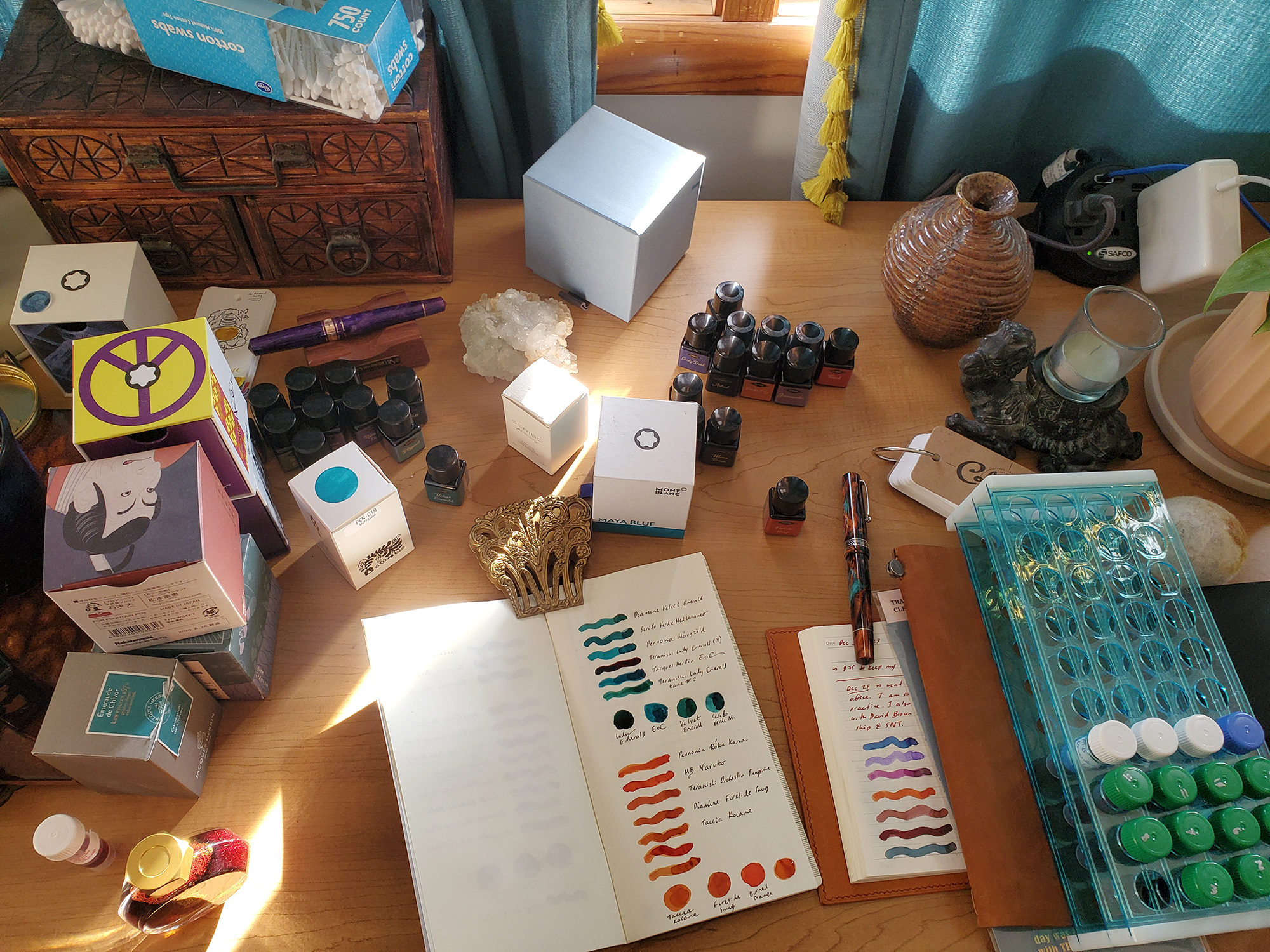
I kept my desk organized during the original testing, but the comparison bit of the experiment resulted in a mess. Bless this mess.
The mess you made was nominated - oh I (do you)
ORANGES: Diamine Fireside Snug
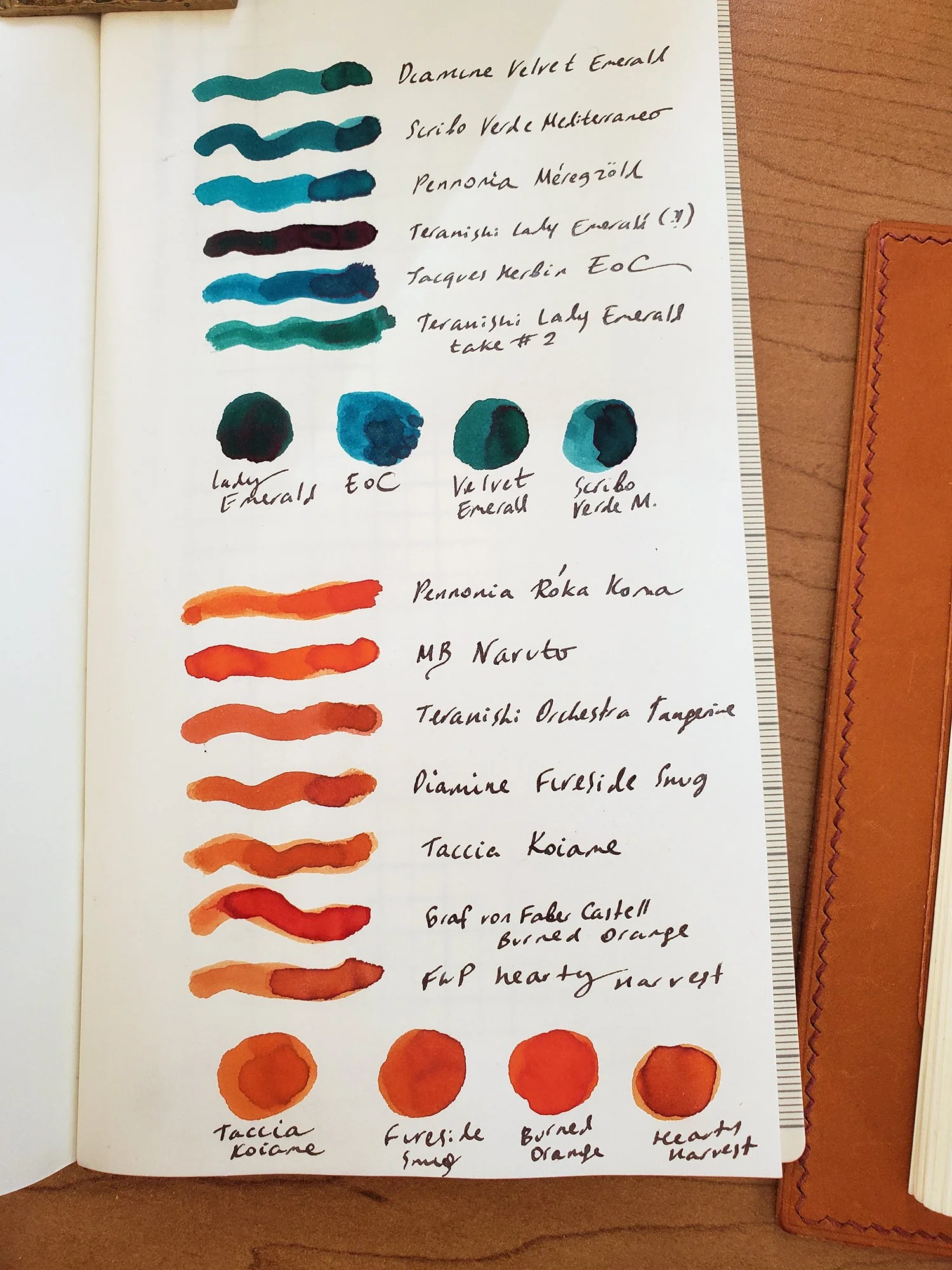
As I suspected, Fireside Snug is very close to Taccia Koiame. It is also close Teranishi Orchestra Tangerine, and quite close to FWP Hearty Harvest, which has shimmer. GvFC Burned Orange is redder. I may slightly prefer Fireside Snug over Koiame - I have a feeling Koiame is just a tiny bit browner. However, I would need to do chromatography to truly distinguish between Orchestra Tangerine, Koiame, and Fireside Snug. I really like Fireside Snug. I enjoy burned oranges. I also rarely ink them.
TEAL-GREEN: Diamine Velvet Emerald
In terms of emerald inks, the plot thickens. Lady Emerald was very weird when I sampled it - I think the sheen condensed? I have no idea. In any case, Velvet Emerald and Lady Emerald are quite different.
Scribo Verde Mediterraneo came close, but is a tiny bit more blue. Since my bottle of Verde Mediterraneo has met an inkcident back in 2021, I stopped using what used to be my favorite ink. Velvet Emerald compares favorably to all of these. So Velvet Emerald now migrates to a yes, and I am excited to ink it.
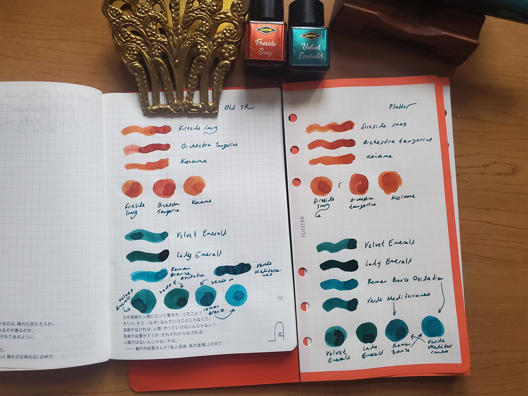
I had some lingering questions about the oranges and the teals, so I did some further comparisons on plotter paper (right) and old Tomoe River (left). Orchestra Tangerine is a bit more red/pink on these papers, but Fireside Snug and Koiame are very close. After staring at these inks on different papers for a while, I feel that I prefer Fireside Snug by a narrow margin, which is a neat surprise - I have loved Koiame for years. and now I have to ink Fireside Snug. But maybe not right away.
In terms of emeralds - I almost always have something inked with an emerald/teal green. Right now, I have Lady Emerald and Stilo e Stile Roman Bronze Oxidation inked in pens. Velvet Emerald and Lady Emerald have a commonality, but Lady Emerald has a lot more sheen, which pools and makes the ink appear darker. The closest match to Velvet Emerald remains Scribo Verde Mediterraneo, which is just. a tad more blue. The more I use Velvet Emerald, the more I love it. Definitely a YES!
Onward to blues and purples!
I was happy that the comparison revealed a lot of variety in my purples. I love using dark purple inks, and the shimmers added to the options.
BLUES: Diamine Blizzard
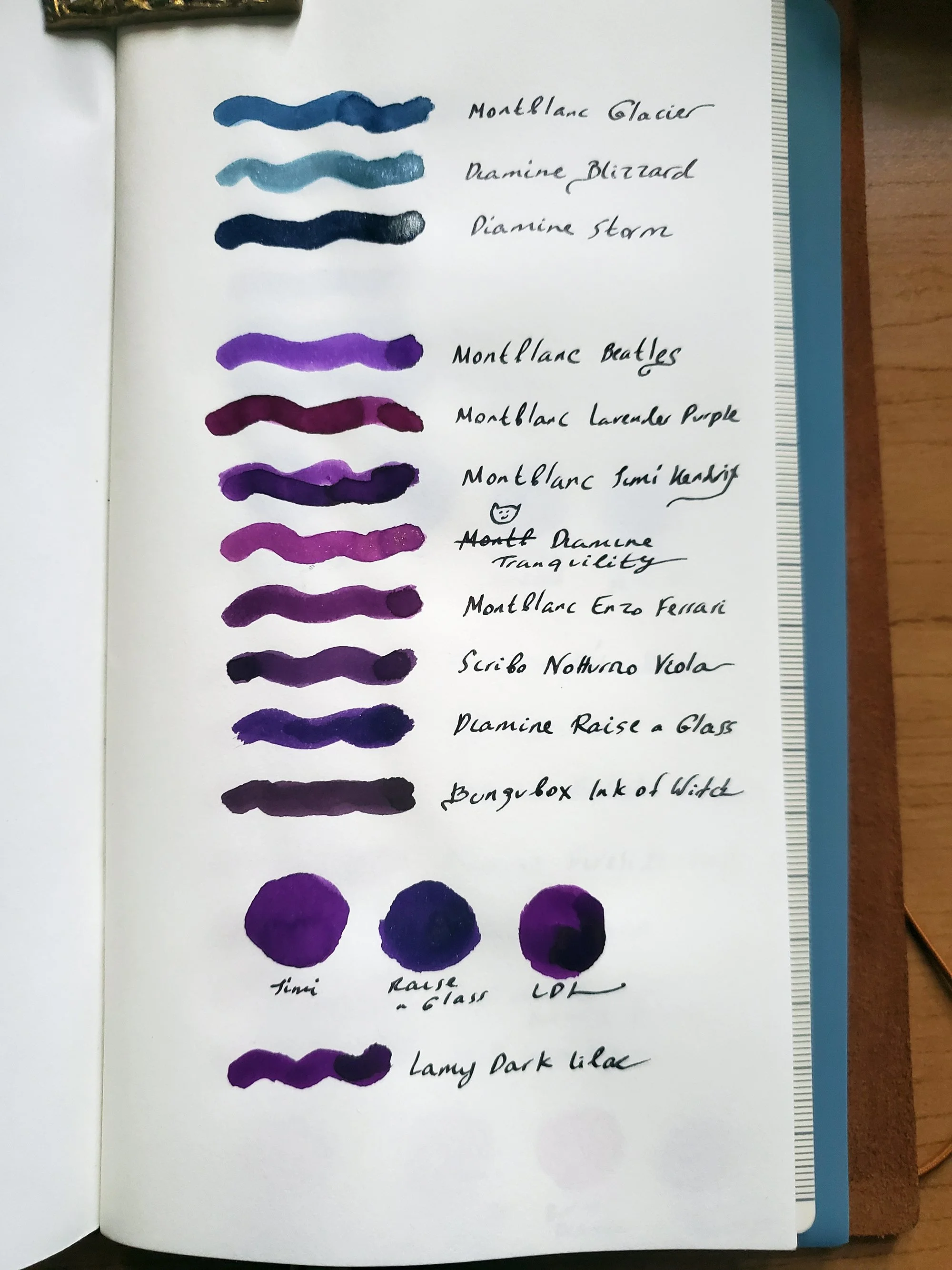
Montblanc Glacier turned to be very different from Diamine Blizzard, even though evokes a similar feeling for me. Blizzard remains a strong yes.
PURPLES: Diamine Raise a Glass and Tranquility
In terms of purples, Raise a Glass is closest to Montblanc Jimi Hendrix, but Raise a Glass is more blue. It is also close to Lamy Dark Lilac, but yet again - more blue.Tranquility is unlike any of the purples I have - it is pinker and brighter.
Conclusions
This is a very strong Inkvent offering for me. It’s probably my favorite, certainly par with the Red Inkvent. I love purples. and have been finding many uses for shimmer samples, so this works great for me. I did not love everything, but many of the inks were exciting. My top 5, in no particular order: Tranquility, Lavender Frost, Rainbow’s End, Velvet Emerald, and Blizzard. I’m going to ink at least one of those for New Year’s - probably more than one.
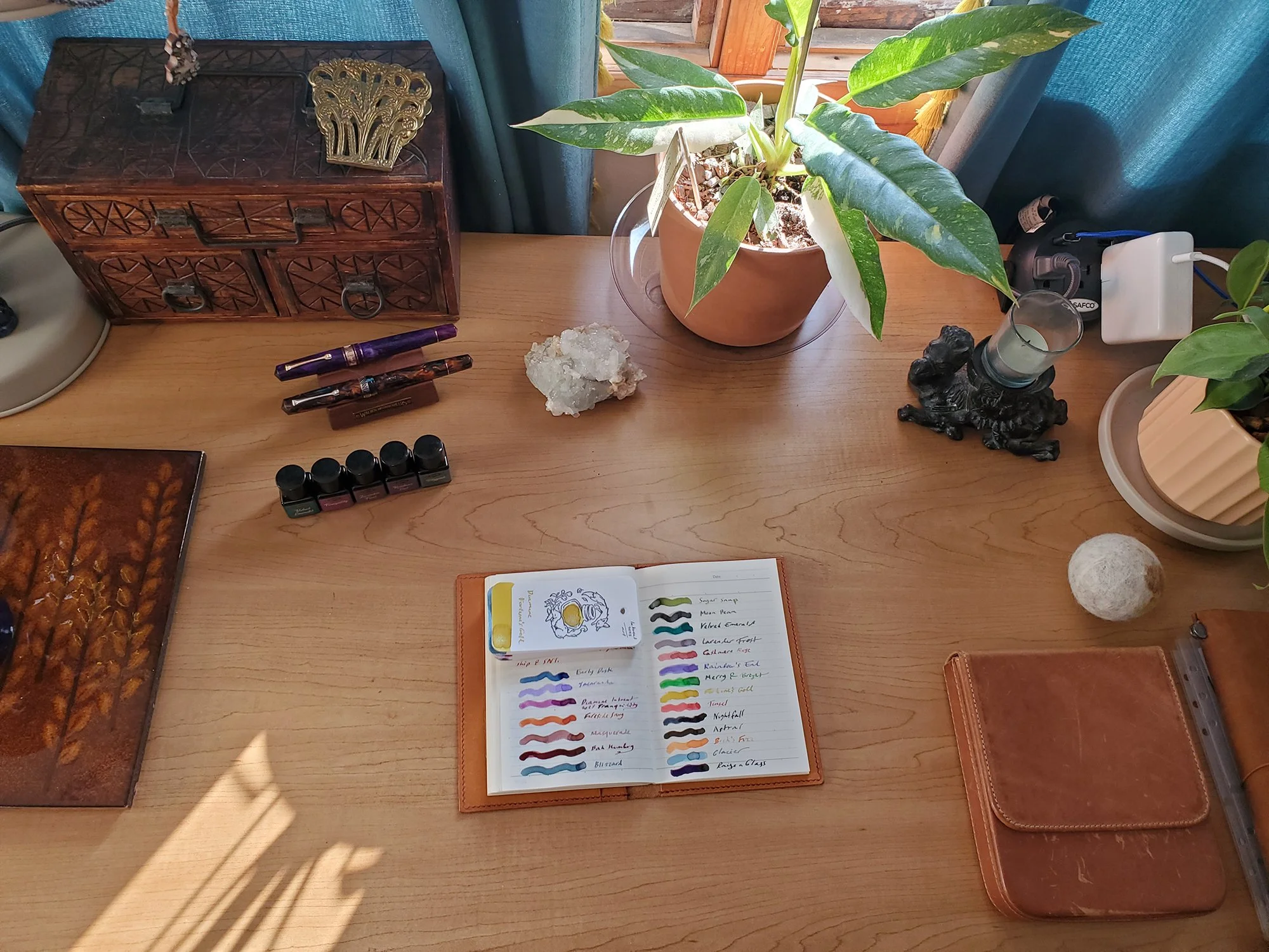
The quiet after the storm: after everything said and done, my desk is back to order. (Some of the new plants will migrate elsewhere, but I want to stare at them for now).

