
The Wet Pen Inks: Deception Pass and Elliott Bay
Note: I purchased these inks with my own money. The post does not contain affiliate links. My reviews always reflect my personal opinions, impressions, and preferences.
A few weeks ago I heard through the pen grapevine that Matthew Gore of The Wet Pen would be releasing some inks. I was not familiar with the channel, or with Matthew’s website, but I went ahead and watched the video. I have very specific tastes in pens and inks, and at this point I know what I like and have a good amount of ink in my ink library, so I am not easily tempted. In this case, I was intrigued by what I saw - the colors looked interesting, the bottle and the packaging were attractive, and I loved the aesthetics. I went ahead and placed an order for two of the three inks: Elliott Bay and Deception Pass. They looked like chromoshaders, with rich color variation, and I admired Matthew’s decision to stick to blues and blue-greens for his three first (?) offerings. The third ink in the lineup is Rainier Blue, a medium bright blue. I felt that the two chromoshaders would go well together, while the cheese stands alone Rainier Blue seemed separate; I have other inks in this category, so I passed for now.

An image from The Wet Pen blog: the three inks are Deception Pass, Elliott Bay, and Rainier Blue.
After I placed the order, I watched Matthew’s Japan series of videos (take a look at the first one here). I discovered that he is a lover of blue ink who went on a tour of Japan looking for Japanese exclusives - mostly Sailor inks in the infamous vase bottles - and he focused mostly on blues! I admire a narrow specialization. And I continued to love the aesthetics of Matthew’s presentation - the videos are thoughtfully put together, and flowed well. I hoped the ink would show a similar attention to detail.
Matthew said that he was mixing the inks by hand - “I've been developing these ink formulas for about a year and a half, and I'm making the ink myself in small batches" (from the video caption) - and that intrigued me, so I went to look for more information, and read Matthew’s blogpost about the inks. I have to say that while I was reading the post, I was put off by the part where Matthew compared Patreon support to begging - it felt unnecessary, and quite unkind. Not everyone has the resources to do a deep dive into ink manufacturing for 1.5 years, and not everyone can do a free blog/channel. I do appreciate the initiative and the research that went into the creation of these inks. A lot of special edition ink is made by established ink manufacturers (like Diamine) for smaller retailers, but this is not the case here.
A week after I placed my order, Matthew sent out an email to let folks know that the inks are delayed.
I just wanted to give you a quick update about what's going on with these inks. Over the weekend, while I was packing up bottles of ink, I discovered that there were problems with some of the bottles of Deception Pass and maybe also Elliott Bay.
I believe that I know the cause, so rather than ship out faulty ink, I decided to mix up new batches of both inks. I should be able to re-bottle them over the next couple of days and ship the inks beginning on Friday or Monday.
Matthew also offered a refund option. I appreciate this kind of transparency. First of all, this is a completely new offering, so I don’t think people would have minded a delay; he did not really need to email - this was welcome. Second, I appreciated a look at his process, and I was glad to see that he takes QC seriously. I sat back and waited.

The ink arrived here safely.
The inks arrived, safe and well-packaged. I love the presentation. It might not be everyone’s priority, but having an aesthetically pleasing and usable glass bottle is very important to me. Filling from good bottles is a part of my fountain pen joy. The Wet Pen boxes, bottles, and labels are beautifully done without being fussy. My only minor qualm is that the names of the inks are not on the labels. One had a sticker on the bottom of the bottle; the other had a sticker on the bottom of the box. These are very minor things for an entirely new ink endeavor.

Elliott Bay on the right and Deception Pass on the left, but you wouldn’t necessarily know. Accompanied by Menagerie friends the birds.
The inks themselves are named after the landscape of the Pacific Northwest, and Matthew’s own home city of Seattle, accidentally one of my favorite cities on earth. Both Elliott Bay and Deception Pass are chromoshaders; both of them have a different color when wet and dry.
Here is how Matthew describes these two colors on his website:
The second ink that I came up with is called Elliott Bay, named after the body of water on which Seattle is situated. This one is an unusual, chroma-shading ink that starts out as a medium-dark blue when wet, but dries with splashes of bright green on some papers.
And finally, Deception Pass is a sister ink to Elliott Bay, named after the State Park and the rocky strait that separates the northern end of Whidbey Island with Fidalgo Island and the mainland. Deception Pass goes down on paper as a greenish blue-grey, but dries as a green with blue shading. I find that Midori Paper gives me the best shading with Elliott Bay and Deception pass.
These are gorgeous colors. I’m not naturally a lover of chromoshading inks - they are usually either too dry for my use case, too pale, or both, but these hit the spot. They flowed well in a glass dip pen. I love the feeling of a perfectly lubricated ink as it meets paper - the definition of sensory bliss. The colors are exciting and unusual. Let’s take a closer look.
I first swatched them on Col-O-Ring and on Plotter paper, which I use everyday. The colors are companionable but distinct :)

Creating a mess while reviewing inks is becoming traditional here.

A closer look.
Here is how they look on old and new Tomoe:

Old Tomoe

New Tomoe, in my Hobonichi day-free
I considered the closest matches I have for these inks, and decided to compare Elliott Bay with Montblanc Glacier Blue, and Deception Pass with Dominant Industry for Wonderpens Chicken in the Sky with Diamonds, which I also received recently. This is also a chance to take a look at how these inks perform on Midori paper.

Comparison between four inks on Midori paper: The Wet Pen Deception Pass and Elliott Bay, Montblanc Glacier, and Dominant Industry Chicken in the Sky with Diamonds for Wonderpens.
First of all, I feel that Elliott Bay is greener on Midori than it is on Plotter and Col-O-Ring. Deception Pass does not seem all that different across these papers.
On Midori, Elliott Bay is quite different from Montblanc Glacier, which is more of a grayish blue, but both inks have a wonderful atmospheric quality which I appreciate around this time of year. Deception Pass is actually quite close to Dominant Industry Chicken in the Sky with Diamonds. I have both in a pens, so you can see for yourself. Chicken Diamonds is greener and a bit darker; Deception Pass is more blue, and does have a color-shifting quality which is not there for Chicken Diamonds. Both are wonderful evocative inks, but if I had to pick one, Deception Pass would win simply because I enjoy the sensory quality of it more than the Dominant Industry. Both inks are wonderful (I hope to review Chicken Diamonds down the road).

Three landscape-inspired inks and a chicken (though sky is a landscape too, to be fair)
I could not resist putting Deception Pass into a pen right away. It’s just too good. I inked a partial fill in my Leonardo Momento Magico Bohemian Twilight with a Franklin Christoph M SIG nib, and it’s wonderful so far. I’m planning to ink up Elliott Bay next.
Here is the ink on Tomoe Sanzen in my Hobonichi:
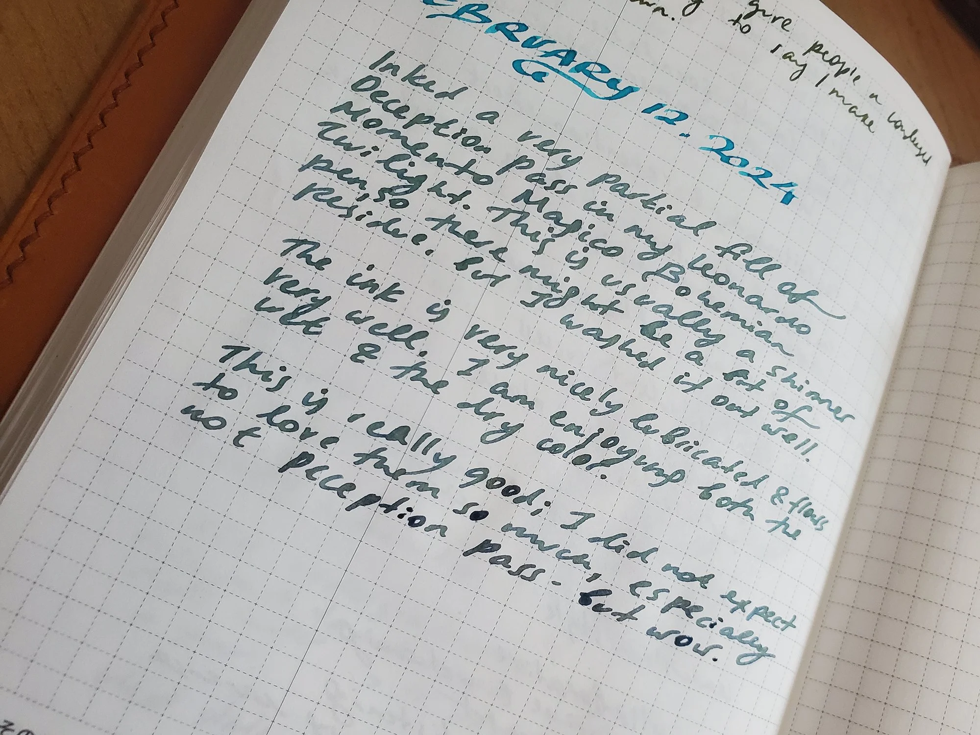
The ink is dry on the top and wetter towards the bottom - you can see a bit of the color change.
Pros: Wonderful evocative colors, a new ink maker, aesthetics are on target. Great attention to detail.
Cons: A new ink maker :) so far, my impressions are very favorable, but I have no idea how these inks will perform long term. Right now, the inks are sold out, and it might be a while before restock.
My final takeaway is, I love these inks and hope that more people will get to try them; I’m also looking forward to more ink colors from Matthew. If one of these inks ends up eating my pen, I will update this post.
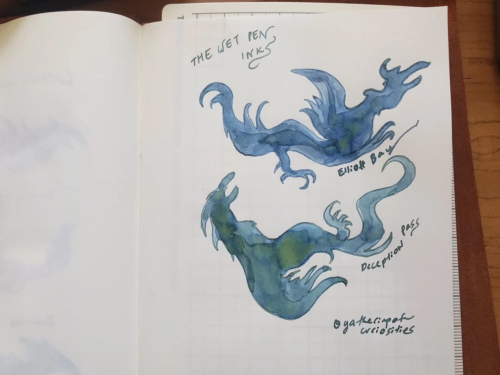
Dragon doodles on Midori :)))